On our trip to the Art Institute, Margaret and I delighted in this painting of Job, which the title card identified as an anonymous Spanish work from the early seventeenth century:
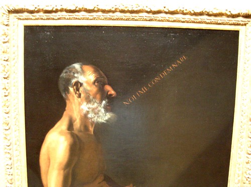
(Job is saying “Noli me condemnare,” “Do not condemn me,” from the Vulgate of Job 10:2: “I will say to God, ‘Do not condemn me; show why you judge me so.‘ ”)
The way the painter adopted lettering that looks like metal type tickles us pink. What does this imply about the way the anonymous painter thinks about speech, about print, about communication? Would a brush script not have sufficed? What models did the painter have — perhaps only the blackletter banner-lettering from cheirographic and woodcut Bibles? Did he think that by emulating a Roman text metal typeface, he rendered the image “modern”?
(Cross-posted to Beautiful Theology)
Micah points out:
Good catch, AKMA. It sure is an unusual use of text. But have you (or your other readers) seen Jan van Eyck’s Annunciation? A similar thing, with the words of the angel coming out in a stream, but Mary’s words in response are printed upside down, so God can read them. What does that say about text and the location of the Holy?
Hi, I followed links from MeFi to Accordian Guy to your page, and
encountered this statement:
The way the painter adopted lettering that looks like metal type tickles us pink. What does this imply about the way the anonymous painter thinks about speech, about print, about communication? Would a brush script not have sufficed? What models did the painter have — perhaps only the blackletter banner-lettering from cheirographic and woodcut Bibles? Did he think that by emulating a Roman text metal typeface, he rendered the image “modern”?
You’ve got the sequence backward. Roman Monumental was formalized
over 2000 years ago. See any temple in Rome, for example the
Parthenon or arches in the Forum. At that time there was no cursive.
Pre-500CE, even handwritten script was all capital — I’ve seen
examples in museums. During medieval times, cursive evolved to
facilitate writing with pen and ink on parchment. Mechanical type
came along just as the Renaissance was blooming, with its conscious
hearkening back to the high Roman era. That is why you see fonts from
the 1500’s and 1600’s developed in the classic roman style, for
capitals at least.
In my opinion, the artist correctly used all capitals to emphasize
that the picture came from _ancient_ times, *not* modern. If he had
used a medieval gothic or brush style, it would have seemed
unenlightened.
Ted
—
Ted Stern
lgtedstern at gmail dot com
Frango ut patefaciam — I break so that I may reveal
[Thank you, Ted — that’s a terrific point. Of course these letters reflect Roman inscriptional style; my orientation toward the modes of illustration more typical of manuscripts and blockbooks, and my familiarity with the subsequent development of type design, distracted me from what you recognized. Marvelous, marvelous.]