Desire

Every now and then, people ask me which sort of fountain pen I collect. The answer is complicated; the simplest version is ‘I collect pens that sellers undervalue’ — that is, bargains. This is in part because of our family finances, and partly because of the fun of hunting (it doesn’t really feel like ‘collecting’ if you walk into a shop and pay list price for a pen).

That being said, even bargains don’t interest me much at a certain point. England overflows with Parker school pens; no, thank you. I’m not the world’s most enthusiastic Parker supporter in the first place, and yet another Parker 17, or Arrow, or Vector, really isn’t going to delight me enough to make it worth the purchase. I greatly admire Parker 45s and could be won over to one at a very good price, but even then…

Other pens would almost always interest me as bargains: Sheaffer almost anything, but especially lever-filling Balances, Flat-Tops, Crest, or Targa. Esterbrook Js in good nick. Parker 51s and 21s, but only in good condition and at a bargain price. Watermans, but Waterman has such a good reputation that their used pens almost always come at a premium.

If I were awarded a pen collection grant, here are some pens I’d look for at a higher price:

    Sheaffer PFM — I shy away from Snorkels, since I haven’t learned to service their fill system, but I’m PFM-curious. They look like a handful, and I do like a big pen.
    Parker 50 Falcon — I love the design of these. I have the matte brown and the gold plate, so I am always on the lookout for the chrome/steel and black Falcons.
    Parker T1Rara Avis, but the Parker integrated-nib style.
    Pilot Murex/Myu — the star of the integrated-nib sky. I have a vague memory of my Uncle Bob of blessed memory having picked up a Murex on his business travels. I’d like one of these some day.
    Pelikan pens in the tortoise-shell pattern. I have an M200 (Old Style), but the tortoise-shell colour is so seductive…
    (I may update this later, as my desires wax and wane.)

There are also some pens I’ll make it a point to collect, perhaps even at fair-market prices when I’m flush. I have a black Sheaffer Connoisseur; I’d like, if I can afford to, to add other models of the Connoisseur line. Likewise, I have a few Targas, but I would always pick up another. These appeal to me for their own sake, and if I see a style I don’t have, I’d think hard about adding it.

Sheaffer Balance, Roseglow

Between 1936 and 1938, Sheaffer manufactured its Balance pens in this dusty-rose striated design. The roseglow — so-called — is relatively uncommon, and somewhat more valuable than your run-of-the-mill green, brown, or grey striated.

It’s their plunger-filler design, and has a slightly stubbed nib.

Its first owner seems to have been Dick Wynn. If it were a more unusual name, or combination of names, I’d spend hours online trying to track Dick down, but I haven’t given it a try to this point.

Sheaffer Roseglow, engraved Dick Wynn

Parker Presence

Although I mostly attend to Sheaffer fountain pens — that is, among the sorts of pen I can afford, Sheaffer pens interest me most — they’re relatively less common here in England than they were in the US, and Parker pens are more common, so if I encounter a pen in the wild (or browse generally on ebay), I’m more likely to see a Parker. Parker manufactured fine writing instruments — Sheaffer just produced pens that, on the whole, I appreciate more, and appear on the English market less often.

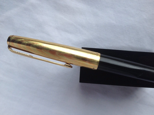
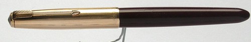
So a couple of months ago, I stopped in at a local vintage clothing shop and scanned their counter full of antique odds and ends, and saw there a handsome Parker 61 with the Rainbow Gold cap.

New Arrivals

I usually prefer to buy pens from non-specialists only if the price is low enough that I can rationalise the risk; one can never be quite sure what has happened inside a pen over long years. This pen sold for a price close to (but still below) its specialist value, and I hadn’t had a treat in a while, so Margaret and I agreed that this would be a reasonable special occasion.

This was not the capillary-filler style of Parker 61, but the later squeeze filler. The nib looks fine, and the trademark inset arrow of the Parker 61 is still there (I have a Parker 61 Flighter whose arrow has, alas, fallen away).

All in all, it makes a very handsome, highly functional addition to the Parker Wing of my collection.

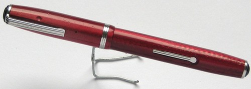
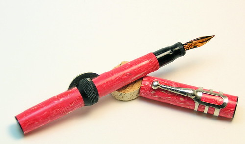
Granted that I would be more likely to find Parkers than Sheaffers, I had resolved to look out for one of the striking Parker 50 Falcons, one of the pen models with the nib integrated into the body of the pen. The most famous of this sort, the prize example, is the Pilot Myu/Murex; Parker had made a similar pen out of titanium, but the materials costs were too high, and the nibs too brittle (if I recall correctly). The Falcon preserved the intriguing style of the integrated nib with more conventional materials, and Parker manufactured them in four models for several years.

I’d been looking out for a Falcon, and had had my eye on two at £48, which was more than I could afford but a low-ish price, I thought. I mentioned them to a dealer-collector one day, and the next time I looked for them online they were gone (this is probably just a coincidence, but if I meet that gentleman again I may ask him about them). I recently put in a low bid on a Falcon on ebay, though, and to my surprise won the auction.

From the outside, it looks mostly like any other metal-plated fountain pen. It’s a pleasant design, but nothing startling. The integrated nib, though, stands out in the pen-design crowd:

The nib is very firm, but it writes smoothly and agreeably. This pen probably came at a discount because of the friction marks where the cap grips the section, but I don’t mind; I’m mostly a writer-collector anyway, and I’m more curious to experience working with a pen than seeking out a perfect specimen. (Not that I turn perfect specimens away.)

I still feel a stronger attachment to Sheaffers, but these Parkers have impressed me very favourably. The hooded nib of the 61 and the integral nib of the 50 both write very smoothly; the pens are attractive, and they lie comfortably in my hand. If I see another, I may succumb to temptation.

Breaking Up and Starting Over

Yesterday I was writing my weekly note home to my mother, and the pen — my jade Sheaffer Flat-top with a stub nib — started scratching as thought it were out of ink. But I knew that couldn’t be the problem because I had just filled it from my new bottle of Diamine Ancient Copper ink a couple of days before.

I discreetly gave the section a twist to look at its innards, only to discover that the sac had disintegrated, and the pen hadn’t filled at all; the feed was holding a little ink, but the appearance of having filled was all illusion. This might have dismayed some people, but it delighted me: This was a problem I could repair on my own, as soon as I got home!

Sadly, when I got home I discovered that all my pen repairs tools are up in my clothes room, covered by a vast dropcloth. Repairs will have to wait.

At the same time, this week marked a different turning point for me. I’ve been a long-time lover of J Herbin inks. “Ambre de Birmanie,” “Eclat de Saphir,” “Larmes de Cassis,” all captivated me with rich, saturated colours and gentle shading. Their reputation as an ink that treats pens gently, and (I must admit) the French naming and the pen-holder bottles sealed the deal.

J Herbin colour swatches

But the last few bottles of Herbin ink that I’ve bought have developed SITB, and I’m getting weary of having to throw out the remainder of a bottle of ink when I see the tell-tale string of ink clinging to a nib. I returned one bottle, but I’ve had two more go bad. (Word on the street has it that they had problems with EU chemical regulations and that everything’s OK now — perhaps I bought my ink at the wrong moment, or I’m storing it especially badly — but with all respect to the centuries-old Herbin firm, I’m backing away.

I’m switching to another brand with a good reputation, Liverpool’s Diamine. It’s their Ancient Copper I had just ordered, and they have some handsome alternatives to the Herbin colours I love. And my Herbin bottles won’t run out right away (I’ll keep using them till I detect a problem). But now I have some exploring to do with even more new options from Diamine.

Diamine Colour chart

Alcove Of The Others

Friday, Meg asked me whether the next installment of my fountain pen photos would take visitors to the Great Hall of Sheaffer — knowing that the Great Hall is the largest room in the gallery. That would make sense, but if I opened up the Sheaffer Hall today, then next week’s tour of the oldest chamber of my fountain pen museum would be anticlimactic. No, today we tour the oldest part of the museum, the Alcove of the Others, and later we’ll enter the Great Hall.
 
When I first began plucking pens from eBay, I was impressed with Pelikans. Margaret had given me a Pelikan years ago when we lived in Princeton (now, very sadly, lost in one move or another), and heaven knows they’re elegant and noble. With some attention to sales patterns, I ended up with a Pelikan 120 (with rather a lot of brassing on the gold furniture), a nice Pelikan 140, a Pelikan M400, and a Pelikan M800 in red stripes. After the M800, I realised I was out of my depth — Pelikan collecting is too rich for my blood — and I’m not able to do any repair work on my Pelis. My last Pelikan came from the Raleigh Pen Show at the end of the year I lived in Durham; I had promised myself a pen show treat, and I like demonstrators, and this pen best fit the circumstances. The photo shows that I use it; it’s hard to get those last drops out without a hydrosonic cleaner! I recommend Pelis highly to anyone who can afford them and doesn’t expect to do any down-and-dirty repair work on them.
 

The Esterbrook Gallery Is On Your Left

A longish time ago, my Mom gave me a fountain pen that had been knocking around her family for years. It was a handsome deep salmon colour; I think I used it a couple of times, then set it aside. The next time it occurred to me to use it, nothing seemed to work and I heard a rattling sound inside the pen. So much for that plan! I kept the pen, though, for the sake of continuity with Mom, and one day in Durham I learned that there was a guy who repairs pens, who lived right in town with me (and in fact, who worked at Duke near me). I arranged to meet Ross and to hand over the pen to him for repair.
 

Esterbrook J Dubonnet (B)
(tooth marks courtesy of one or another family dog, I believe)


Ross explained this Esterbrook (identification was a no-brainer, since it says ‘Esterbrook’ on the clip and the barrel imprint) was a ‘third-tier’ pen, but that it stood out for having handsome plastics, a simple, easy to maintain lever-filling system, and excellent nibs. Indeed, Esterbrook nibs are readily interchangeable, and could be obtained in a variety of styles. Esties are hard-working, durable, good-looking, excellent writers, and are still relatively easy to track down in the USA (much less so in Britain; I haven’t seen any bargain Esterbrooks, and only even seen a few that passed through Peter Crook’s hands, via South Africa). These are perfect pens for beginners to collect and repair, and so I (as a beginner) did just that.
 
Continue reading “The Esterbrook Gallery Is On Your Left”

Meet The Parkers

I blogged a few weeks ago about the Parker 51s that I had recently encountered. I intended at the time to post some photos, but I didn’t have a tripod, and I hadn’t figured out the lighting here, and several reasons besides. This afternoon I undertook a massive fountain-pen shoot, and kept going till my battery gave out. I’ll shoot the rest of my collection some other day, but for now I’ll show you my Parkers, since that’s the only brand I got all of with today’s go-round.
 
The newly-arrived 51s are the stars of the day; they’re the most distinguished Parkers I’ve acquired (no Vacs, no old Duofolds). The distinctive feature of the Parker 51 is its fully hooded nib; in contrast to most traitional pens, whose nibs stand out and form an attractive, functional part of the pen hardware, the 51 conceals all but the very tip of the nib under its plastic hood. Right now I’ve inked and am using this gold-and-burgundy 51, made in Britain, and without the typical date markings, as far as I can tell.
 

Parker 51 Mark I Burgundy

 
(I’m selecting just one photo of each pen, which will still make this a big long post, but there are many other images in my photo set at Flickr.)
Continue reading “Meet The Parkers”

Parker Sunday

A few months ago, I had only the most remote acquaintance with Parker 51 pens, one of the landmark models in fountain pen design. (I’m sure I handled one at a Triangle Pen Club meeting sometime, but just in passing.) I have several Parker 21s, which are very closely related to the 51 (and a very fine substitute if the 51 is out of your range, as it was for me for a long time). Though I kept my eyes open for bargains, I hadn’t seen any 51s in the wild.
 
So earlier this year, I saved up my pence, and combed my collection for pens that didn’t really fit in or that I wasn’t especially committed to, and brought them down to the Antiques Fair to Peter Crook’s booth, and traded in the pens and some cash for my first Parker 51. It’s a lovely pen, but I realised after using it for several inkings that the medium nib was broader than I like, so I put it aside for a while. Then almost immediately after, I noticed a pen on eBay that looked a lot like a 51, but which was not clearly labeled (a huge source of eBay bargains, and for some eBay scams where the seller lures alert scavengers into bidding for an apparently mislabeled pen that turns out to be a more pedestrian alternative) — so I put in a cursory bid for the might-be 51, won, and found that it was a 51 indeed. Again, though, it came with a medium nib, so I put it aside with my carefully-sourced 51.
 
Last month, I took both my medium 51s in to Peter for him to swap out the medium nibs for fine nibs, an operation that won’t be frightfully expensive but will make them much more usable for me. At that very Fair, I wandered past a booth with a pen that I recognised as yet another 51, and I casually asked the vendor how much he wanted for it. He didn’t answer right away, started pattering to size up my interest, so I went to put it down (I already had two of them), and he quickly got to the point — ‘Say, £3’. I made a slightly dissatisfied face, and grudgingly dug 3 quid out of my pocket, and received my next Parker 51, this one a stub nib from 1940 (according to the barrel’s dating marks).
 
Today I’ll stop by the Antiques Fair, pick up my newly-nibbed 51s from Peter, drop off the stub nib (its nib is slightly askew in the section, and wants a small adjustment), and will in short order be the custodian of three very fine Parker 51s, for little more than the fair price of a single example. I’m eager to put the fine nibs to work, and to see how the stub works once I get it back from Peter next month. This is part of the delight of collecting these specimens from forty, fifty, or more years back — with decent care at a craftsperson’s hands, they work perfectly, indefinitely, distinctively, and beautifully. But first I have to run off to church!
 

Additions To The Gang

I was working away on my commentary on the Epistle of James this past week, when Margaret popped into the office with a small but bulky package. In that package was a very lovely note from my friend and former student Suzie Stark, and within were two very elegant pens that had been Suzie’s mother’s.
 
One of them is a handsome ‘mottled Vulcanite’ pattern, manufactured by Conway Stewart for Lyon, Ltd., of Glasgow. As far as I can ascertain, it’s from between the wars; it resembles pens to which Conway sTewart assigned the model number 200M:
 
Lyon - Conway Stewart
 
The other is a Waterman, a cracked-ice body with flat black caps at top and bottom. I don’t have enough reference material to pin down the date on the Waterman, but I’d bet that it was the successor to the Lyon/Stewart pen for Suzie’s mother, so from the 40s or 50s:
 
Waterman's
 
I will entrust these to a responsible restorer when I can. The Lyon/Stewart pen will be especially tricky, because it has a chip out of the screw threads, which will make it very hard to remove the section (the bit you grip that holds the nib in) without further damaging the threads. The Waterman shouldn’t be too hard. For less special pens, I’d give it a try myself, but I would hate to cause these any harm — and I’m very eager to set them to writing.
 
I’m a little frustrated about the photos. Our flat is smallish, with no north light, and I haven’t rigged a light tent to even out such light as I can muster. I don’t even have a tripod here to hold my camera still — so these photos are not as fine as I’d wish. Making a light tent and tracking down a second-hand tripod go on my to-do list, for after the James book is finished and after taxes are all sorted.
 

Whose Best?

My student Laura Naysmith pointed my attention to yesterday’s feature in the Independent, the one that purports to identify the ‘ten best fountain pens’. It’s not clear from the website what criteria they apply, but the result is a very peculiar selection. Granted that they seem to draw only from contemporary pens (thus ruling out, for instance, Parker 51s, and Sheaffer Targas), the list includes both basic starter pens and ornamental bling pens.
 
For instance, I admire the Lamy Safari as a rugged, simple, inexpensive daily pen — but that doesn’t mean I think it’s one of the ten best. I have little use for hypertrophic ornamentation (and expense), but some elegant pens are quite excellent, and some bespoke pens are well worth their price simply as objets d’arts or jewelry. But for a ten-best pen, I’d want a pen that was functional as a writer, with a smooth, sweet nib, attractive in design, with a predictably long useful life. And, to be fair to the Independent’s ratings, I confess I’d want to exercise some latitude for pens I just love, or don’t.
 
So as of today, if I had to name Ten Best, I’d probably nominate Sheaffer’s Targas or Connaisseurs (or both) among my ten. Parker 51s, also, and P21s and P45s for the economically cautious (Parker 17s have turned up often recently too, another good cheap variation on this theme). The Independent didn’t name Pelikan pens at all; I haven’t held a 1000, but the 800 is pretty sweet. At a lower price point, Pellikan 400s and 200s are estimable pens, too. Sheaffer’s Triumph nibs are a joy to write with; I haven’t held a PFM (‘Pen for Men’, guess what era that comes from), but they have a reputation attested by the high prices they command on the used market. Since I can’t testify to their quality first-hand (ho ho ho), I’ll nominate my Sheaffer Triumph as a stand-in — not at all the same pen, but as a placeholder for that particular nib (also on the Targas, but I like Sheaffer pens, so there). The Mont Blanc 149 — the pen my mom gave me when I graduated from doctoral work, and that I inherited from my dad, is a classic — it has become a stereotype for pen-as-status-symbol, and they’re very often counterfeited, but it’s a wonderful pen.
 
I’ll give special consideration to Esterbrooks J, LJ, and SJ lines for their simple good looks, interchangeable nibs, easy maintenance, and durability. I happen to love my Sheaffer Flat-Tops, with their gold nibs about an acre wide. And since my repertoire is relatively limited, I’ll leave two slots open and just name a top eight. You may have good cases for alternatives: (Parker fans will laud their Duofolds and Vacumatics, Waterman fans will extol the flexy nibs that Waterman was known for, and I’m curious about Pilot Vanishing Point models, but these eight are wonderful. It feels great to write with them; I find typing increasingly unsatisfactory, and I look forward to finishing off the project that more-or-less requires keyboard input in favour of beginning more free-from compositions next.


Now, enough typing for tonight. I have to write something! (after I cook dinner)
 

Spors Unbound

After considerable strain (resulting in some damage to the section), I finally wrenched open my Spors glass-nibbed fountain pen a while back. Only Sunday, however, did I obtain an ink sac suitable (I used a 12mm sac) for the very narrow portion of the section to which the sac is glued. Since the thin-shelled barrel is a cavernous void, I would guess that Spors originally equipped this pen with a sac that was wider in the body, but with a narrow neck. It doesn’t make much difference to me, because I don’t anticipate ever needing more than a modest amount of ink in this pen.
 

Spors Glass Nib

 
The photo doesn’t adequately represent the intense pinkness of this pen. It’s hard for me to believe that Spors found buyers for so outrageous a shade in the 1920’s or 30’s; this pen would look much more at home in 1968 than 1930. I’ll be waiting for an opportunity to wear it in public.
 
Writing with a glass nib differs less dramatically from regular-nib writing than I expected. Pen users refer to nibs that bend noticeably as flexy (at the extreme, as a “wet noodle”); their rigid antithesis is called a nail. As the term suggests, firm nibs really do approach the rigidity of the glass point that the Spors offers. I wrote a sample page with the Spors, and it wasn’t at all uncomfortable (even if it’s hard to dispel the apprehension that at any moment one might break the point of one’s pen).
 

Writing With Spors

 
The point is fine, and the flow is not quite predictable (pause for a few seconds, and you get a heavier flow till the acculumated ink drains off), but it’s a very striking functional curiosity.
 
Now, yesterday the mail brought a tortoise-shell Sheaffer Balance with a smooth italic nib. Unfortunately for me, it wasn’t a lever-filler (which I could refurb) but a vacuum-fill (which exceeds my competence). I’m very eager to get that one spruced up, though, for it’s exactly the feel of the sort of italic-nibbed pens I’m used to.