Trevor’s working on a way of refactoring the appearance of the Disseminary — partly ’cause it’s been long enough, partly because we cam up with the old appearance right at the start, and have learned enough to be ready to make some changes, partly because the Moveable Type database that powered the old design melted down last winter and we never rebuilt it.
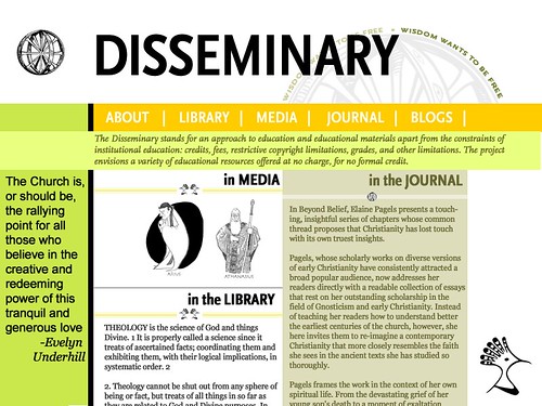
Trevor sensibly thinks that we ought to solicit feedback for the new design before we implement anything — so, how does it look to you?
If that pic is the new design, then I think it looks positively wonderful!
I recommend bigger padding around your text boxes. Things are looking a tad cramped.
Looks good to me!
Will you also pick up the discussion of Radical Orthodoxy, or did that peter out?
This looks great! Let me know if you need any help with MT on this.
Pascale’s comment on padding makes sense; it doesn’t have to be much more, I think, but some if possible.
My first impression is that much more information will now readily available to the visitor, both in terms of “what is all this about” and in terms of navigating the site. I find the color scheme and basic layout inviting. Cool!