About two weeks ago, maybe a few days more, my friend and former student the Very Rev. Hope Tinsley Benko (I didn’t know they`’d made you a canon! How excellent!) directed my attention to a link to a series of articles in Slate. She remembered my diligent attention to signs and visual communication, and she thought (quite correctly) that this series would interest me.
(Digression: Few things touch a teacher as much as people remembering what they tried hard to teach. I’m so very moved that some of that stuff stuck with Hope, and that she recalled me when she read the Slate article — thanks, Hope!)
The whole series is fine and informative, and I implore church leaders to think through their own efforts at communication with the mind of a designer of wayfinding signs. (I have an idle dream of a church conference session in which everyone brings the most recent bulletin from their Sunday worship, and we go over the many ways that they succeed (or not) in helping worshippers make their way through the liturgy. I can say that from my present position because I know my cathedral boss is very attentive to those matters.)
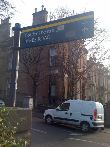
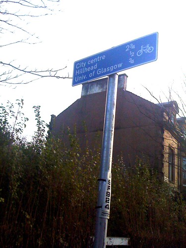
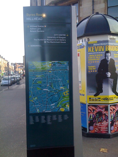
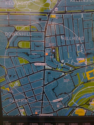
While we’re on the subject, I should note that Glasgow does very well at wayfinding signs (at least, in the medium-posh neighbourhood around the University). Here are a few I photographed on my way to church last Sunday (in the “extended” version, in case someone doesn’t want to load all the photos):
And there are more photos from that walk on my Flickr feed, including some details of the signs I show above.
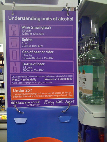
At the same time, Scotland isn’t a paradise for signage. Although the sign below is attractive enough and has the right information, look it over and think about its import and effects:
I take it that the idea is to say, “You shouldn’t drink more than this,” a laudable warning. But now, just how much is the stopping point? At first glance (and in a market, how many people will stop to give it more than a first glance?), the placard seems to suggest a woman might drink two or three of the pictured “units” daily, and a man drink three or four. Only if you examine the sign carefully and figure out the appropriate calculations will you conclude that each of the icons represents a different quantity of “units,” such that although a man may have three or four shots of whisky (1 “unit” each), he should only have two pints of beer.
Now, if you’re the kind of person who studies signs and works out the details of what they’re trying to communicate, I would dare to guess that you already have at least a general idea of how much you ought to drink. If contrariwise you are someone quite ignorant of the physiological effects of alcohol, I suspect you’re also disinclined to parse the signage in the drinks department of the market. So I’m-a give Tesco a big signage FAIL.
• Don’t introduce unfamiliar abstractions such as “units” that don’t correlate directly to familiar quantities (“a shot,” “a pint,” “a glass”)
• Don’t include information that’s not directly relevant (the percent alcohol by volume, although it’s relevant in a strict sense, doesn’t help communicate the “Don’t drink too much!” message)
• Don’t obscure the prescriptive message (“Here’s the amount not to exceed”) by highlighting numbers that aren’t the specific quantities you want people to pay attention to
With all that blank space on the right-hand margin, and by removing the distracting, confusing “units” and “ABV,” you could make a cleaner, stronger sign that says “Men shouldn’t exceed 2 pints” and “Women shouldn’t have more than a glass and a half of wine.” (If you really want to make an infographic that correlates units and ABV and different kinds of drink, you could do it below.) I’d make a mock-up myself with Photoshop, but I’ve already spent too long on this post.
This being Scotland, I doubt people would pay much more attention to the clearer advice — once I realised they were saying “two pints” rather than “three or four,” my first thought was “As if!” — but at least the sign would be making the strongest case it could for the message. On the other hand, if people paid attention to the sign, they might buy less.


Here in Australia, we talk about standard drinks – the amount of a particular alcoholic beverage that contains 10 g of alcohol. The health promotion people use it to help people to keep their alcohol consumption to a safe level. Those at whom this is principally targetted are typically more interested in using it to ensure that their blood alcohol level is not so high that they can’t drive. 🙂 People want to know how many standard drinks (or units in Scotland, I assume) there are in the typical serving size of their favourite form of alcohol, so they can decide whether the number of drinks they’ve had at the pub means they should leave the car behind and get a taxi home. You would be amazed at how quickly your average young drinker who is otherwise virtually amathematical can tell you how much alcohol s/he has consumed in the two cans of whiskey and cola s/he’s consumed since s/he arrived at your offspring’s party, and how carefully they will examine the information on the can to make sure that this particular brand has the same alcohol content as another brand!
On your idle dream: I love that idea. In fact, it might be something that could be carried out virtually, by posting bulletins for discussion.
I’ve been impressed with the thoughtfulness of my current temporary church home about wayfinding. Their website includes a “roadmap” to each service (the 11:15 is here: http://www.theredeemer.ca/pages/1115roadmap.html), and the diagram from that page about where to go during communion is also printed in the bulletin. Now, all that isn’t supported by signage in church, and the services tend to be a little under-ushed, but I really appreciate the fact that they’ve thought so carefully about what the newcomer will need to know, and they’ve thought through the experience all the way from getting in the door through coffee hour afterwards.