The other day, Si IM’ed me to make sure I had seen the day’s PvP comic strip, in which Brent Siena fulminates at businesses’ poor choice of typefaces. Si was teasing me, since I get itchy about poor type design, but then he went on to sympathize with Brent, and make some critical observations of his own on type. The apple seems not to have fallen far from the tree.
This afternoon, Pippa needed trip to a local mall in order to find the right pair of shoes. While she went into fine-discernment mode and scoured the mall for the right footwear, I stopped by the smoothie booth to obtain a cold, fruity beverage.
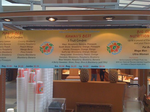
I asked the congenial young man at the booth why some of the offerings use italics, while others used upright type. He explained, “Well, each one has different ingredients.”
“Right,” I agreed, “but in some of the smoothies those ingredients are listed in italics; does that mean something different about them?”
“Yes, for instance that first one has strawberry, banana, and pineapple in it.”
“Right, I understand that, I can read — never mind, no big deal.”
“No, sir, what do you mean?”
“OK, you see how some of those letters are kinda slanty? And some of the other letters are straight up and down? Does that mean the slanty words are different in some way, or are they all the same?”
“Wow! I never noticed that! Look at that! That’s real attention to detail, that you noticed that!”
I ordered the Maui. It tasted good, and when the server spotted me later on in the afternoon, he asked how I liked it. “Terrific,” I said, “Thanks a lot.”
nice kid (i assume), though, it completely failed by his education.
i mean if. (i was failed by my typing class. or maybe that’s i failed my typing class…)
It’s nice to see that he affirmed your attention to detail.
My favorites are the signs advertising this way:
“Fresh” Fish